A symptomatic graph
Symptomatic graph
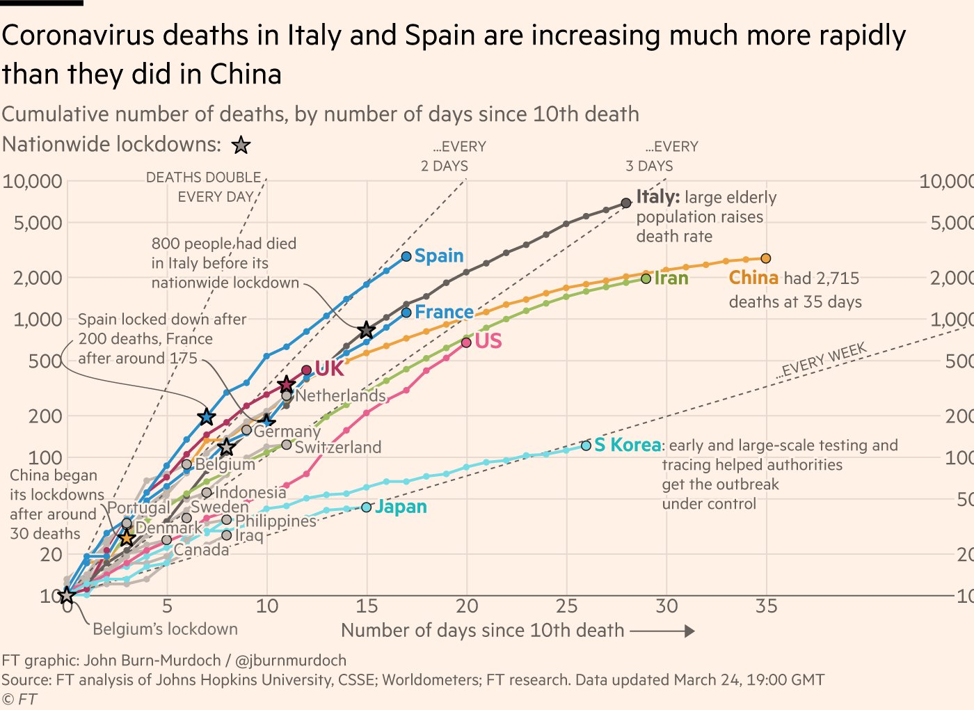
Death graph
Recovery graph.
Seems to me the average person may look at the daily count of new COVID19 infections and the graph may not look as scary.
Symptomatic graph
Death graph
Recovery graph.
Seems to me the average person may look at the daily count of new COVID19 infections and the graph may not look as scary.