
Adding a horns down logo?
New uniforms?
16,039 Views |
72 Replies |
Last: 1 yr ago by Maroon Dawn
I agree but don't think it would be bad to have just 1 game a year where we do something different. I always thought it would be cool if they let the seniors design 1 uniform a year to be worn when they want. I wouldn't hurt to get the players a little excited.Slicer97 said:
I prefer the current unis. Clean, classic look.
Also, we do need the white helmet back for a game or two.Tejas Ag 10 said:I agree but don't think it would be bad to have just 1 game a year where we do something different. I always thought it would be cool if they let the seniors design 1 uniform a year to be worn when they want. I wouldn't hurt to get the players a little excited.Slicer97 said:
I prefer the current unis. Clean, classic look.
Our uniforms are awesome now
If we had numbers that match the font we use on every other sport jersey, i.e. baseball, basketball, they would be great. I hate the font adidas made up for our numbers, they don't match anything else and we don't use them anywhere else. The '98 throwbacks were our best unis in a long time.
I do miss the shoulder stripes from the sumlin era, but those maroon jerseys looked faded out compared to the current maroon, and the beveled numbers were awful. Just give us another season or two, we'll change them again, its a tradition!
I do miss the shoulder stripes from the sumlin era, but those maroon jerseys looked faded out compared to the current maroon, and the beveled numbers were awful. Just give us another season or two, we'll change them again, its a tradition!
strbrst777

Joined:
Aug 24, 2006
Posts:
8,638
How long do you want to ignore this user?
The numbers from the baseball and softball jerseys need to be the football numbers. As a matter of fact see the all white softball uniform where the team also wore tall white socks with maroon stripes. That should be our away uniform starting in mid October when it cools down. The numbers, the maroon shade, and the font of Texas A&M are perfect.RealMcCoy09 said:
If we had numbers that match the font we use on every other sport jersey, i.e. baseball, basketball, they would be great. I hate the font adidas made up for our numbers, they don't match anything else and we don't use them anywhere else. The '98 throwbacks were our best unis in a long time.
I do miss the shoulder stripes from the sumlin era, but those maroon jerseys looked faded out compared to the current maroon, and the beveled numbers were awful. Just give us another season or two, we'll change them again, its a tradition!
My wish is the to bring back the SUmlin stripes and remove the name on the chest and replace with the A&M or A&M inside Texas logo center chest. Regular numbers. All white pants.
I dont know why we took the numbers from a TI-89 calculator and put them on our jersey in the biggest sport yet give all the other sports good looking fonts.
I found out what they meant with the new Adidas PM uniforms.
It is Patrick Mahomes - Adidas.
I am hearing we will be wearing PM Adidas along with Tceh who has been an UnderArmour school forever..
Can anyone confirm this?
It is Patrick Mahomes - Adidas.
I am hearing we will be wearing PM Adidas along with Tceh who has been an UnderArmour school forever..
Can anyone confirm this?

Aggie said:Hubert J. Farnsworth said:Slicer97 said:
I prefer the current unis. Clean, classic look.
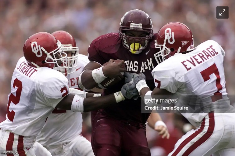
I agree. The current uniforms are the best I can remember. Much prefer the clean, classic look. Hated the Sumlin era uniforms. I think the current ones are based off of the ones from the 2018 Kentucky game with tiny differences. Those looked awesome with the old SEC logo.
One difference, with the uniforms from that game, was that the helmet and jersey colors matched.
Those uniforms we wore vs a Kentucky were a 90's throwback .
/cdn.vox-cdn.com/uploads/chorus_image/image/61678367/usa_today_11391146.0.jpg)
And...perfect...
Tech is switching to Adidas, I would assume in July. We are a flagship Adidas brand and we are the one flagship in the SEC so that would make sense to have us wear the PM. Jordan does something similar usually with only one program per conference.
Farmer @ Johnsongrass, TX
Joined:
Sep 25, 2017
Posts:
5,639
How long do you want to ignore this user?
Napalm was invented because of that style of jersey. Kill it with fire.Fatboy Thaddeus said:
We need the Tostitos collar back

Never understood the collar
I like these!
They are a great start. Get rid of the giant state of Texas logo, instead move it to above the number and make it smaller then insert our A&M logo. Change the helmet logo color to either dark silver or metallic maroon.
Agreed on the shoulder stripes. This is always one of my favorite mockups. It's simple and clean while still being unique instead of just like other schools with solid jerseys and pants.VP at Pierce and Pierce said:The numbers from the baseball and softball jerseys need to be the football numbers. As a matter of fact see the all white softball uniform where the team also wore tall white socks with maroon stripes. That should be our away uniform starting in mid October when it cools down. The numbers, the maroon shade, and the font of Texas A&M are perfect.RealMcCoy09 said:
If we had numbers that match the font we use on every other sport jersey, i.e. baseball, basketball, they would be great. I hate the font adidas made up for our numbers, they don't match anything else and we don't use them anywhere else. The '98 throwbacks were our best unis in a long time.
I do miss the shoulder stripes from the sumlin era, but those maroon jerseys looked faded out compared to the current maroon, and the beveled numbers were awful. Just give us another season or two, we'll change them again, its a tradition!
My wish is the to bring back the SUmlin stripes and remove the name on the chest and replace with the A&M or A&M inside Texas logo center chest. Regular numbers. All white pants.
I dont know why we took the numbers from a TI-89 calculator and put them on our jersey in the biggest sport yet give all the other sports good looking fonts.

If I said what I'm thinking of this one I'd get banned for eternity!!!!!!TheDraw said:
:format(webp):no_upscale()/cdn.vox-cdn.com/uploads/chorus_asset/file/19555863/helmet.png)
HORRORS!!!!!AgTrip said:
I like these!
Absolute perfection. Put our A&M logo inside Texas on the chest right below the collar and it is unique, sharp, and classic. All white pants with no stripe. If there is ever a cold game, players wear tall maroon socks. If cold on the road, tall white socks with maroon stripes similar to the Bears. OU wears pro style two toned socks in cold weather games and it looks really sharp. I would like to see us do the same.
yeah to me there's no need to have the Texas A&M on the jersey. The helmets are great with that.
Love that pic.,
Love that pic.,
Keep the current uniforms we have now, make the helmets match the jerseys, add an alternate white helmet with maroon logo and preferably white facemask, and make the logo on the helmet smaller so that it's not partially covered by the chin straps.
I always liked these


What Starts Here Changes The World...SA-AG72 said:
Adding a horns down logo?
hell no
"Roswell, 1947, there was a uap (ufo) that crashed, in fact there were 2 uaps, 1 crashed and one flew away and the other one did not and was recovered by the US GOVERNMENT."
- Lue Elizondo-former director of the Pentagon's Advanced Aerospace Threat Identification Program-August 20, 2024
Are A&M's core values..optional? Who has the POWER to determine that? Are certain departments exempt? Why?
Farsight Institute, Atlanta, GA
- Lue Elizondo-former director of the Pentagon's Advanced Aerospace Threat Identification Program-August 20, 2024
Are A&M's core values..optional? Who has the POWER to determine that? Are certain departments exempt? Why?
Farsight Institute, Atlanta, GA
I'm not gonna say it again. 56' throwbacks
[url=https://ibb.co/GVdpVMv] [/url]
[url=https://ibb.co/GVdpVMv]
[/url] PremenstrualVatoLocoAggie said:
Hearing scuttlebutt around the pond that we are getting a new line of Adidas uniforms.
They are called Adidias PM sports wear.
Not sure what the PM stands for but that is the word.
Something about it being like Nike MJ sports wear unis that Oklahoma an North Carolina and other schools wear.
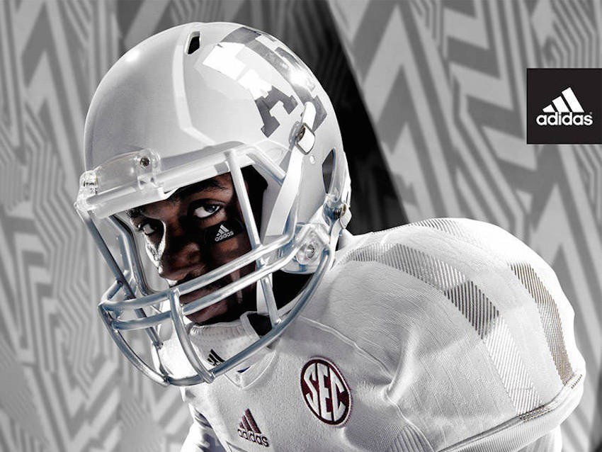
I like the traditional uniforms, but I also like the icy whites as an alternate every once in a while.

Just stick with the same uniforms from the past several years, but add a white helmet as an alternate.
. ThisBLSmith04 said:
Just stick with the same uniforms from the past several years, but add a white helmet as an alternate.
I want our jerseys to look like this all the time. Get the A&M helmet and maybe an alternate helmet of the T like the baseball hats last night. Looks sharp, likely wont do it.Aggie Class of 2026 said:
I'm not gonna say it again. 56' throwbacks
[url=https://ibb.co/GVdpVMv]
This one:BLSmith04 said:
Just stick with the same uniforms from the past several years, but add a white helmet as an alternate.

Bobby Jimbo said:This one:BLSmith04 said:
Just stick with the same uniforms from the past several years, but add a white helmet as an alternate.
I'm also a fan of this combo. Sucks we lost that game
It is a great helmet, good jersey, awful pants. The grey is not necessary and it is an ugly shade. I hope that never comes back.Aggie Class of 2026 said:Bobby Jimbo said:This one:BLSmith04 said:
Just stick with the same uniforms from the past several years, but add a white helmet as an alternate.
I'm also a fan of this combo. Sucks we lost that game
zephyr88 said:
Always thought that Maroon on Maroon on Maroon on Maroon was badass.
and... no bevel!!!
Tooooooooombs
Is that a giant weiner?TheDraw said:
Aggie Class of 2026 said:Bobby Jimbo said:This one:BLSmith04 said:
Just stick with the same uniforms from the past several years, but add a white helmet as an alternate.
I'm also a fan of this combo. Sucks we lost that game
But grey facemask. And make the pants solid white.
I want a script Aggies uni, similar to what basketball and baseball have had for a few years. Maybe lean into a retro theme and add a maroon block T helmet too
Featured Stories
See All
31:24
3h ago
2.1k
18:48
1d ago
6.2k
Reed expects A&M's offense to remain explosive
by Billy Liucci
13:24
1h ago
730
9:56
3h ago
846
SEC Player of the Week Gavin Grahovac has found his power stroke
by Ryan Brauninger
2027 IMG Academy EDGE Zyron Forstall commits to Texas A&M
by Jason Howell
ReturnOfTheAg
NFL draft insider calls Marcel Reed "truly terrible"
in Billy Liucci's TexAgs Premium
32